In 2022 I ended up revisiting the cast of 2nd - by accident, in a way - and in doing so I realised two things:
- I hadn't drawn these characters for seven years
- I first drew them in 2003, nearly twenty years ago!
So, for their Almost Twentieth Anniversary, I thought it was the appropriate time to dive into their design history and evolution.
Like many young artists, my concept for 2nd was mostly "inspired" by a piece of existing media.
I'm not a fan of Yu-Gi-Oh as a franchise, but media properties focussing on monster battling always interest me because I have a vested interest in creature designs and they can be of huge inspiration to me whether I engage in the specific series or not.
So at some point in 2003 I saw an episode of the Yu-Gi-Oh cartoon wherein the villain summons his monsters onto the field, then imbues them with a special power which transforms them into wacky, over-the-top cartoon versions of themselves, in contrast to the relatively more serious anime styled designs.
Well, if it's good enough for them it's good enough for me so I set about searching for some of my own characters who I could "cartoonify" in a similar way.
Of course, my usual drawing style was pretty cartoony to begin with so the difference might not be too apparent...
To distinguish the original characters from their toon counterparts, I referred to the new characters as "Toonsketch XXXXX" since I felt they needed some sort of unique identifier, though none of the characters toonified were particularly important so they were gradually phased out while the toon counterparts shed the "Toonsketch" name and became the primary owners of their monikers. With me so far?
LUNIS is the only toon who never has a toonless counterpart, so what is shown here is the very first concept drawing of him. I wanted something angular and mean looking, sort of like a graffiti design and as the angry moon was my first step into this idea he became cemented as the first member of the team.
DRIZZLE is shown here in one of his earliest drawings from around 1993 when he was a villain for my character Blot (but was otherwise not very intimidating) and one of his last drawings before the indoctoonation process where I tried to make him more sinister with an angry storm cloud face and lightning arms.
QUARTZ the wooden cuckoo time deity is a lot more detailed and rigid in his first incarnation and only had a couple of appearances to him name before he was tooned. He would arrive via cuckoo clock, which would fall out of the sky and break open to reveal him. The clock would come into play many years later.
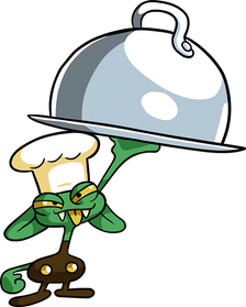
CRUMBS Looks very similar here to his toon counterpart, but the circumstances of his conception required him to be a realistically proportioned biscuit man carrying a realistically proportioned tommy gun.
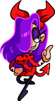
BROOKLYN does not have an original incarnation. At least, not one that I can find. She is certainly based on an old character, the man who bowls cartoon bombs like bowling balls, but that drawing is either locked in my parents' loft or was discarded decades ago.
ZEPPELIN never got a full body drawing, only this headshot which I think came after I was already putting together the cartoon crew. The point is that his body was supposed to be very thin and light with huge wings. So also here is the original toon sketch, from the same page as Lunis.
THE FLYING BUTTRESS OF VENISON has a similar to vintage to Crumbs, from around 2002 while I was in college and felt unique for being the only character in the cast based on an inanimate object. Granting it sentience seemed like a very toony thing to do.


And so the characters got Tooned.
As this was in my earliest internet days one of the biggest benefits to designing these characters was that I could colour them, since I've never been much for colouring in traditional mediums.
The main desire was to make them silly and colourful, stretchy and bendy and I contemplated basing them on different animation styles though that didn't get much further than "Brooklyn" being mildy anime.
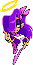
It's worth noting that at this point, since these were the "Toonsketch" versions of existing characters, the purple-haired girl did not have an official name, as I was hoping to eventually find that old sketch and christen her. This lack of identity lasted for quite a few years.


With a cast of crazy characters I was quite pleased with I was eager to draw them regularly so it was mere weeks after their inception that they got their first makeover.
I liked what I had so far, but I wanted to push them further so the intent with this set was to exaggerate them, make them more twisted and sinister. Not nasty or villainous but edgier, feeding into that graffiti angle I had already touched upon.
This reaulted in Lunis becoming a crazier shape, the purple-haired girl becoming much taller and thinner and the buttress getting crooked.
I also notably made Drizzle a regular white cloud. The original Drizzle was a stormy cloud so the Toonsketch version was originally grey, but I reasoned that a neutral white would work better as standard, with him being able to change colour to match different weather/emotions.
But it was only a few weeks difference so there were no major design shifts at this point.

2006 is the sweet spot where I never made individual profile images of the characters but I lost all of the development files so I'm only left with this line-up.
With a clear increase in artistic ability I was able to do a lot more with the cast this time around.
I used shading as an attempt to differentiate the "real world" character of Replay (airbrush shading) and the "toon world" characters (cel shading.)
Quartz gets his clockwork key here (I would often forget to draw his key or his tail and with so many appendages sprouting from a relatively small torso he was starting to get a bit cluttered at this point.)
Zeppelin also receives his multicoloured horns here, something to break apart his large blue body a bit.
The 'kink' in the Buttress's shape now becomes an odd part of its architecture, the overall shape of this character gets a bit weird and inconsistent for a while. The antlers are also bigger and shaped more like hands. With a lack of any permanent limbs, the Buttress is not very versatile so I was thinking of allowing it to use the antlers for manipulation.
Brooklyn is still anonymous.


I got my first graphics tablet in 2009 so by this point I had been using it for a year. Better than last year but still pretty loose, you might even argue that these ones don't look as good as the 2006 cast.
Since most of my characters are designed through the lens of computer games, this was where I standardised signature weapons for everybody. Crumbs and Brooklyn were almost always portrayed with their respective gun and bombs, but now the others also had props to work with.
Lunis's object is supposed to signify his telekinetic powers, but also sort of manifests here as a rubber bouncy ball.
Quartz was supposed to have a feather duster but I couldn't draw one so it is represented as just a feather.
The Buttress is full of all sorts of ballistic weapons already so for a basic armament I gave it a battering ram.
And look! Brooklyn is actually named here! After drawing her for seven years I was getting sick of her not having a name and still couldn't find the origin sketch so I finally granted her this name. If I ever do find that old sketch what will I do? Change her name? That's a bridge I'll have to cross if I come to it.


It's a new 2nd generation! By this point I had long dropped the "Toonsketch" prefix and this is where I took a step back and made some big changes for the good of the cast, rather than being beholden to their original looks.
I had a crack at making these profiles looks like actual graffiti designs, but you can tell it was clearly an afterthought and one that wasn't executed very well.
Ever since the beginning Lunis was difficult to implement in situations because he had no limbs, spoke telepathically (so his mouth never changed shape) and was difficult to draw from any other angle. in 2013 I made a concerted effort to make him more versatile by giving him arms and legs. This helped a lot, and even though his new crescent body is a more standard shape, the symmetrical limbs on an asymmetrical body looks quite quirky. He also got another eye which floats in the air. I'm not totally sure why I made this choice but I think it gives the impression of an overall design which has a large chunk missing.
Drizzle, in an effort to give him a bit more detail, an extra little something to look at, gets weather "hair." The idea here is that is takes the form of other styles to fit different atmospheric conditions, such as a snowy flurry perm, or a big sun afro. The tornado coif would have been the standard one, but it was an idea I fell out of love with very quickly so it only appeared in one other picture.
Quartz is another big winner this time around, as I integrated the cuckoo clock that he was vaguely associated with right into his design! An unusual new body type to suit his clumsier personality!
Crumbs's body got a little streamlined with smaller limbs to balance out his shape a bit more, while Brooklyn made the final transition to thin, noodly limbs.
Zeppeling also gets much more streamlined with a fancy new serpentine shape. It goes against the original joke of giving him a big fat body and tiny little wings, but look back at previous incarnations and you'll see I never really got a good balance of body, arms and neck. Thisflows much more nicely and it's still satisfyingly odd to see his arms so low and his wings so high. Is it just one huge neck!?
The Buttress goes back to basics with a more simplified castle shape and leaner antlers, while the rudder starts to look more mechanical from here on out, as I begin to move away from the black Wobbuffet tail.


The difference of three years is very noticeable from 2003 to 2006, but very little changed between 2013 and 2016.
And why not? I was really pleased with these at the time, but wanted to redraw them for the sake of the 2nd Trumps project.
The notion of giving every character alternate forms based on different animation styles is about as old as the characters themselves and I did draw many of them in 2010 but this particular project brought all of them together at the same time.
The main differences here are with Drizzle, who instantly loses the weather barnet and gets brand new eyes, with the glassy white shine from his old beady eyes now become white pupils in a black sclera, allowing him to be more expressive.


When I came to revisit the team in 2022 there was no immediate desire to "reinvent" them in any way, but as I looked over the previous incarnations I started reflexively tweaking things here and there, there and here, and new ideas started to develop.
The big style shift here is making an effort to lean further into the edgier, twisted look of 2003 Again and trying to hit that graffiti style even more (something I actually managed to do more convincingly this time with the casts new "summoning circle" designs. In doing so they moved away from the more simple, animated cartoon inspired look and became rather more detailed.
I also went back to 2010 and endeavoured to equip the crew with their old signature weapons.
This time I tried to exaggerate the size of Lunis's 'head,' in reference to his telekinesis. The side effect of this was that there was no longer space to attach his left arm, so I made it into a floating arm and removed the floating eye, to emphasise the asymmetry of the design and bring him back to his roots.
Drizzle has always been tricky to iterate on since his design is so simple, so I opted for a few new accesories. A pair of sunny sunglasses to contrast his umbrella and some wind pressue cufflinks, his gloves being the only piece of clothing I can exploit for detail.
Quartz barely changed at all, he's been pretty strong since 2013 but I did subtly change parts of the clock, using actual reference for once!
Crumbs hasn't changed too much, but I've reinstated his lips from his very first appearance to make his identity as a gingerbread man more obvious, and given him a little bow tie to really try to drive home the point that's he's supposed to look a lot cuter than he acts.
Brooklyn's shoes needed to look more like bowling shoes and less like canvas shoes so they ended up being more rigid and clumpy. Historically, unless you can actually see her fingers in the holes it looks like she's carrying a regular cartoon bomb so I resdeigned that by flipping the method: Instead of a bomb with bowling ball holes in it, it now looks more like a regular bowling ball with a bomb fuse on it. And of course she can carry ones of different size and colour.
Finally, I felt she needed a little something more around the head. I tried an earring or hairpin in the shape of a bowling pin but settled on a head scarf, quite befitting of a retro bowling aesthetic.
Zeppelin got more twisted and angular in general, and I reinstated the 'swirl' design more than in recent versions, plus I added a few patches in reference to his ability to inflate his body for certain manoeuvres and make him look a bit scrappier.
Perhaps the greatest benificiary of this set of redesigns is The Flying Buttress of Venison. Like Lunis it has always been devoid of (permanent) limbs but it also never spoke, so it was difficult to see it as part of the team, so to speak. I felt like it always had the air of a pet or a baby rather than an equal.
A pair of legs was out of the question because it's the FLYING Buttress and I didn't even want to suggest the option of grounding it. Arms also wouldn't work because it already has a plethora of mechanical arms that can emerge from hidden doors and hatches carrying a bevvy of weapons so a permanent set would overlap that too much.
I could, however, give it a voice. As you can see there is now a tannoy speaker sticking out of its battlements so that it can finally converse with its peers, but rather than a first person voice I was thinking it should talk like there's a person inside the Buttress or like a radio transmission, something that isn't quite direct so as to maintain some peculiarity. Testing may be required but if I'm careful I think it could work. I've also reasoned that it can go by the nickname "BV" just so that it's easier to include in conversation.
Its battering ram weapon is now just the triceratops skull which bursts out of the clod of dirt as if a fossil and the rudder looks even rudderier. The antlers have also been regressed to a more antler shape with a new selection of sharp implements embedded in them.
Altogether a pretty successful update and I was especially interested to find that three particular design changes here (Drizzle's shades, Crumbs's lips and Brooklyn's bombs) appeared back in my 2013 development sketches, so it's intriguing to know that I had the same ideas again but my sensibilities have changed enough that this time I decided to implement them!
So for now, that's 2nd.
They're no longer front and centre in my creative oeuvre but I still thoroughly enjoyed revisiting them and will no doubt do so again in the future.
I'm very pleased with what I've ended up with and can really see how my changing tastes and - perhaps more importantly - intervening experience has shaped them.
And before you go, here's every characters individual timeline for your convenience!
And, since these timelines take up so much space and I've got nothing left to say I'm going to add a filler sentence here and a little bonus character at the bottom to make this black box look a little less bare!